
Interior Design Project Before and After Images Woodstock , Georgia

Woodstock Single Family Home Interior Design Project
When a client is ready for a change, it is important to assess just how much change they are willing to confront. Interior design is a well-known can of worms. It is tough to alter a couple of things within a room and not support those new items with other important transformations.
When entering this couple’s bedroom, we noticed the old Berber carpet, textured ceilings, mismatched furniture pieces, and insufficient lighting. The room looked gloomy and uninviting. Due to the lack of storage in the bedroom, the space looked cramped with dressers and chests lining the walls, not the least bit relaxing and comforting for a working couple seeking tranquility at night.
The Walkthrough Results In An Initial Plan
We discussed how the couple was ready for new furniture pieces, willing to part with antiques that were handed down for generations and were mismatched and too small. They understood that the textured ceiling had to be dealt with, the carpet was 20 years old and the window treatments added to the outdated feel. We concluded pretty quickly that nothing was to be saved and reused within this room. After peeking into their tiny master closet and finding that they were also using hall closets for the overflow of their clothing, we had to provide a better solution.
The Use Of Color In This Interior Design Project
To solve their storage issues, we designed built-in custom cabinetry with hanging storage and plenty of shelving to fill an entire wall of the bedroom. Since this storage area was not the room's focal point, it was important to make it sort of inconspicuous. Choosing a wonderful neutral and soothing tone for the bedroom walls, we finished the cabinets in the same tone, Sherwin Williams 7567 Natural Tan. Her favorite color is blue, which we implemented as an accent wall behind the bed, using Benjamin Moore HC-148 Jamestown Blue. It provides interest in color since most within this room is a neutral tone. Keeping in mind the couple’s love for antiques and traditional design, we added picture frame mouldings but used flat trim pieces to modernize this technique. Painting the whole wall one color, including the trim, also modernizes the traditional look.


The color story remains relaxed, with the eye landing on the accent color on the headwall, but surrounded by whites, ivory, light, and dark wood tones, all within a neutral realm.
The client was excited to implement gold metal tones in her home, which she has seen trending in interior design magazines, so we used gold hardware and lighting for a touch of glam. She also favored crystals on chandeliers but used in a more modern way, Visual Comfort lighting provides the perfect chandelier for this room.
We chose carpet as the flooring for this main floor retreat, carpet having the important quality of holding sound, making the room quiet for relaxation, even when house guests with small children are running through the hallways. The carpet is a fun herringbone cut and loop pattern, which holds up to all the foot traffic since the master is on the main floor. The furniture offers a transitional feel, with the beautiful and graceful swooping curved lines of the queen bed, the French-inspired, curved face of the lamp chests and drawer chests, in a mix of light and dark cherry wood finishes.
There is no better way to relax than having a calm and soothing environment!
The living room was recently furnished, but the room lacked a sense of order and a more updated appearance. With a few key pieces, new lighting, occasional tables, a rug, and accessories, we improved the interior design of the space. Working with existing pieces is always a challenge, but a simple paint color change can make all the difference. Choosing a cooler tone of paint with all the warm-toned furniture was the right answer. Farrow and Ball Pale Powder #204, known for its wonderful delicate and subtle blue paint color with a touch of green, was a perfect choice. The client at first was unsure of the “new neutral,” but after seeing the whole area painted as it also flowed into the ancillary hallways, they were pleased with the results. As the color “blue” in all its hues made its way into various parts of the home, it also lent itself to accents. The bright teal lamp in the room was chosen with the existing accent pillows in mind, and the client loved that color so much, we used a similar tone for the dining room walls.
The dining furniture was an existing set of handed down through generations antiques that were also going to stay in the space. Making the design work within a client’s budget is important, but choosing a paint color to enhance those pieces is challenging. We chose Sherwin Williams 6222 Riverway, which gave new life to the old. A few key accessories, such as modern art and concrete lamp bases as the lighting, renewed the space.
The Importance of Lighting in Interior Design
Another important change within a home is the lighting in each room. In this home, we chose all-new lighting for the ceilings. We concentrated on using the warm gold tones with a touch of modern black iron for a few fixtures, mixed with softer options in smaller spaces. The combination seemed strong and bold and exactly what this home needed. Updating lighting within a home makes a big difference, and this is where the homeowner was willing to extend their budget. Each chandelier or ceiling fan they owned was outdated, and they were aware of what an impact these selections will make when planning their budget amount.

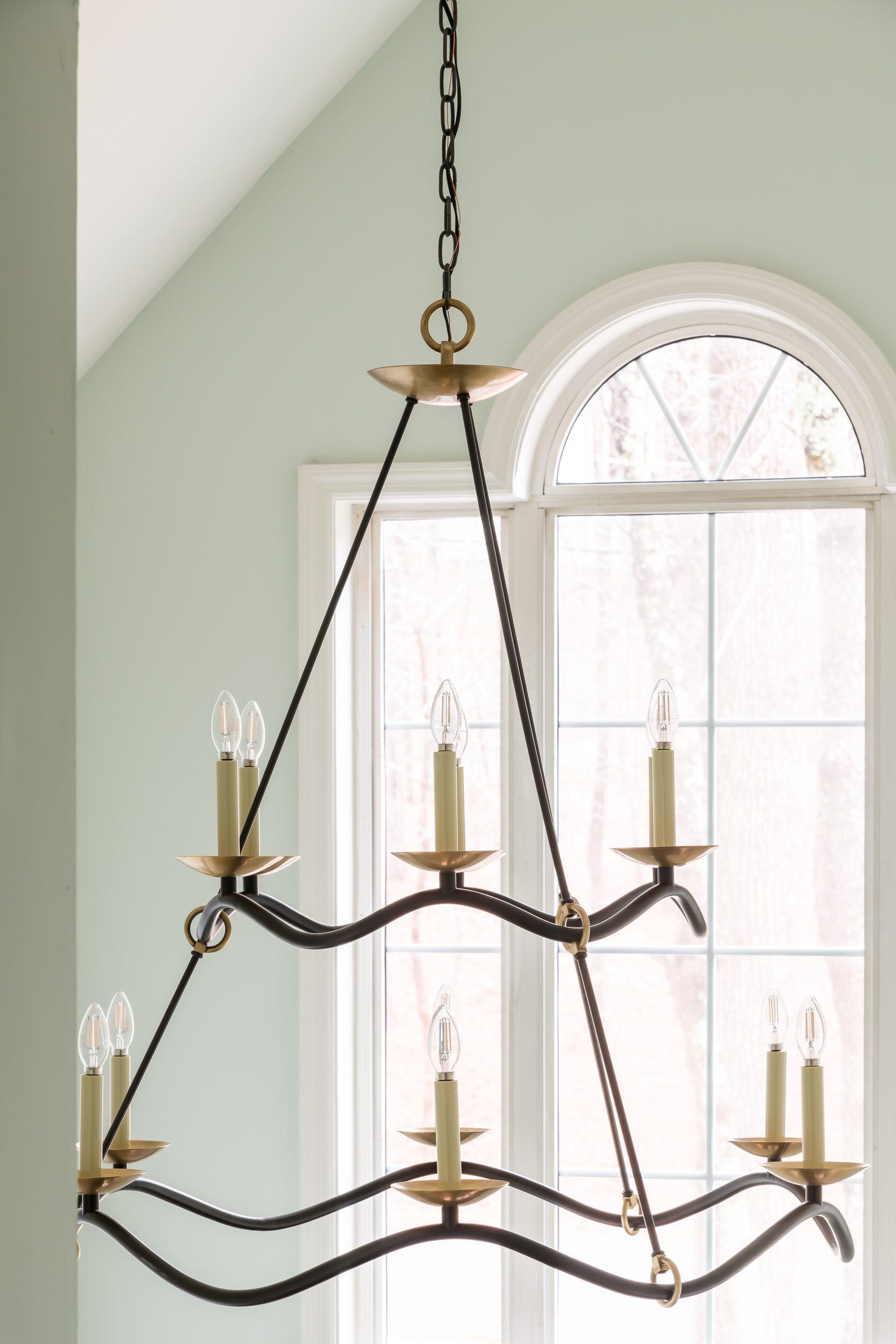


The foyer in this home is a two-story area where using the correct scale of lighting was key. Often, designers see the wrong scale used, like the chandelier being too small for the space. In a foyer, depending on the size, the design opportunity is choosing a rug, an entrance table, some accessories, and of course, the ceiling fixture, which can provide the most impact. We used a playful black iron chandelier with gold accents, the style again being transitional. We mimicked those tones within the mirror and then lightened up the accessories around the darker tones. The stairwell is facing the front door here and is also an important area for change. The existing color of the oak wood railings and steps did not work with the newly renovated floor, which was hickory. We stained the stairwell a tone of black, paying careful attention to the spindles, newel posts, and the steps to make sure they are all the same tone. We then stained the front door black as well. We updated the runner selections with a loop construction indoor/outdoor product that would handle the heavy foot traffic of the family and their furry friend. The foyer is now a sophisticated introduction to the home, which this couple is extremely proud of. They often entertain friends and family, and now they can do that with a newly found confidence in the look of their home.
Are you seeking an interior designer in Fulton County or Greater Atlanta? Let's talk about your interior design project. Contact me, Andrea Bixler, by clicking here.